
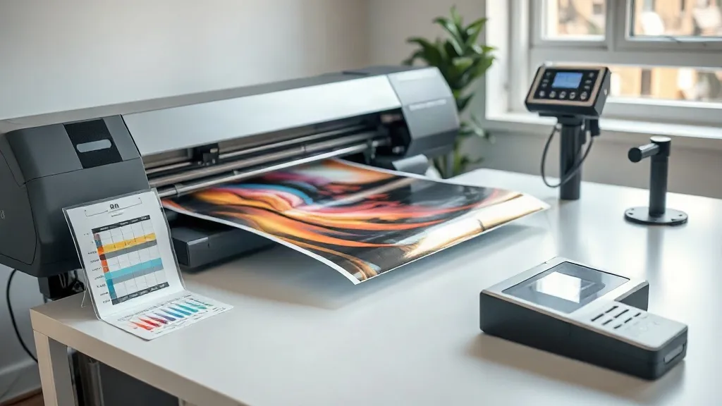
You have probably experienced this: you spend an hour perfecting a design on your monitor, send it to print, and the dtf transfers come out looking like a different artwork altogether. The reds are muddy, the skin tones are green, and the blacks look washed out. It is frustrating, especially when you are trying to build a reputation for quality. The good news is that color inconsistency is rarely a mystery. It is almost always a workflow problem, and it is fixable with a systematic approach to color management.
Why Color Shifts Happen in DTF Printing
DTF printing involves more variables than most people realize. Your monitor emits light, your printer lays down ink, and your heat press transfers that ink onto fabric. Each step interprets color differently. Without a common language, you are essentially playing a game of telephone with your artwork. The common language is an ICC profile, a file that tells each device how to translate color values into something it can reproduce.
Most beginners skip color management because it seems technical and time-consuming. They rely on default settings and hope for the best. But once you see how much time and material you waste on reprints, the upfront effort of setting up a proper workflow pays for itself quickly. A consistent color process also builds trust with clients who expect their brand colors to be accurate.
The Three Devices That Need to Agree
Think of your workflow as a chain with three links: your monitor, your printer (and its RIP software), and your heat press. If any link is weak, the final output suffers. Your monitor needs calibration so you are not editing on a screen that lies to you. Your printer needs a profile that matches its specific ink set and media. Your press needs stable temperature and pressure so the transfer behaves predictably. Neglect one, and you will chase color ghosts indefinitely.
Building Your Color Management Foundation
Before you touch a single design file, get your environment in order. This is not busywork; it is the bedrock of repeatable results. Start with your monitor. A hardware calibrator costs less than a few wasted rolls of film and will give you a reliable reference point for every job. Set your monitor to a standard brightness, usually around 120 cd/m², and use a neutral gray background in your design software to avoid color cast interference.
Next, ensure your workspace lighting is consistent. Avoid mixing daylight from a window with warm overhead bulbs. A simple desk lamp with a daylight-balanced bulb is enough. You want to evaluate prints under the same light every time, because color perception changes with illumination. This small step alone can prevent many “is it blue or purple?” debates.
Calibrating Your Monitor
Follow the calibrator’s instructions and create a profile for your display. Name it something obvious like “DTF-Work-Monitor” and set it as default. Recalibrate every four to six weeks, or whenever you notice your prints drifting. Keep a printed reference chart taped near your desk; it helps you spot shifts before they become costly.
Printer and RIP Settings
Your printer’s RIP software is where the magic happens. Most modern DTF printers come with a RIP that supports ICC profiles. You have two options: use the profile provided by your ink or film supplier, or create a custom one with a spectrophotometer. For most small shops, the supplier profile is a solid starting point, but it assumes ideal conditions. If you change film brands, ink lots, or even humidity levels, a custom profile becomes worth the investment.
In your RIP, set the correct media type and resolution. Avoid the temptation to crank up ink density beyond recommended levels; more ink does not mean better color, it often means muddy details and curing problems. Keep a log of your settings for each film and powder combination. This log becomes your troubleshooting bible when something goes wrong.
From Screen to Press: Keeping Color Consistent
Once your digital workflow is stable, the physical transfer step demands equal attention. The heat press introduces heat, pressure, and time variables that can alter color appearance. A print that looks perfect on film can shift during pressing if the temperature is too high or the pressure is uneven.
Start by establishing a baseline press setting for each fabric type. Cotton behaves differently from polyester blends, and dark garments require more careful handling. Use a heat gun or infrared thermometer to verify your press platen temperature; the display can be off by several degrees. Pressure should be firm and even, but not so heavy that the transfer squashes the ink into the fabric texture, which dulls colors.
Always perform a test press on a scrap piece of the actual garment before running a full order. This is especially important when you switch to a new batch of dtf film or powder. Small changes in the adhesive can affect how the ink layer sits on the fabric, subtly altering the final hue. A two-minute test saves hours of rework.
Evaluating Prints Under Proper Light
Judge your pressed transfers under consistent lighting. A daylight-balanced lamp or a window with indirect sunlight works well. Avoid judging color under fluorescent tubes, which can make whites look blue and reds look orange. If you must evaluate under different conditions, compare against a known reference print. Over time, you will develop an eye for subtle shifts, but the reference print keeps you honest.
Common Color Problems and How to Fix Them
Even with a solid workflow, issues pop up. Here are the usual suspects and their remedies.
- Colors look dull after washing: This is often a curing issue, not a color profile issue. Ensure your powder is fully melted and the ink is properly fused. Under-cured prints lose vibrancy quickly.
- Reds print orange: Your printer profile may be clipping the red channel. Try a different rendering intent in your RIP, such as perceptual or relative colorimetric, and see which gives a closer match.
- Blacks look brownish: This can indicate too much ink or improper powder application. Check your ink limits and powder coverage. A densitometer reading can confirm if you are over-inking.
- Inconsistent color across the sheet: Uneven pressure or a worn platen pad on your press is a likely culprit. Inspect and replace worn parts.
Keep a notebook or digital log of these fixes. Patterns will emerge, and you will soon diagnose problems before they ruin a job.
When to Reprofile
Reprofile your printer when you change ink brands, film type, or if you notice a sudden shift that settings cannot explain. Also consider seasonal changes; humidity and temperature can affect ink viscosity and curing. A quick recalibration of your printer profile every few months keeps you ahead of drift.
Finding Reliable Supplies and Local Support
Your color workflow is only as good as the materials you use. Inconsistent film or powder can sabotage even the best settings. When sourcing supplies, look for vendors who provide batch consistency and clear technical data. If you are searching for dtf transfers near me, prioritize suppliers who offer sample packs so you can test before committing to a large order. Local support can also be invaluable when you need a quick answer about a color issue.
For those who want to dive deeper into profiles and workflow optimization, resources like dtf transfers offer guides and community insights. Building a relationship with a knowledgeable supplier reduces guesswork and helps you stay productive.
Frequently Asked Questions
Do I really need a spectrophotometer to get accurate colors?
Not necessarily. For many small shops, a well-calibrated monitor and a supplier-provided ICC profile are enough to achieve acceptable results. A spectrophotometer becomes valuable when you demand precise brand color matching or when you frequently switch materials. Start with the basics and upgrade only when you hit a wall.
How often should I recalibrate my monitor and printer?
Calibrate your monitor every four to six weeks, or whenever you notice your prints looking off. Printer profiles last longer but should be refreshed when you change ink lots or film brands, or if you see a sudden color shift. Keep a log to track when you last calibrated.
Why do my prints look different on different fabrics?
Fabric composition affects how ink adheres and how color appears. Cotton tends to absorb more ink, while polyester can make colors look brighter. Always test on the actual garment and adjust your press settings and color expectations accordingly. There is no universal profile that works perfectly across all fabrics.
Can I use the same ICC profile for all my DTF jobs?
It depends on your consistency. If you stick to one film, one powder, and one ink set, a single profile can work well. But if you vary materials, you will likely need separate profiles or at least adjust settings per job. Keep detailed notes to streamline the process.
What is the biggest mistake beginners make with color management?
Skipping monitor calibration. Editing on an uncalibrated screen is like painting blindfolded. It leads to endless adjustments and wasted materials. Calibrate first, then build the rest of your workflow on that stable foundation.